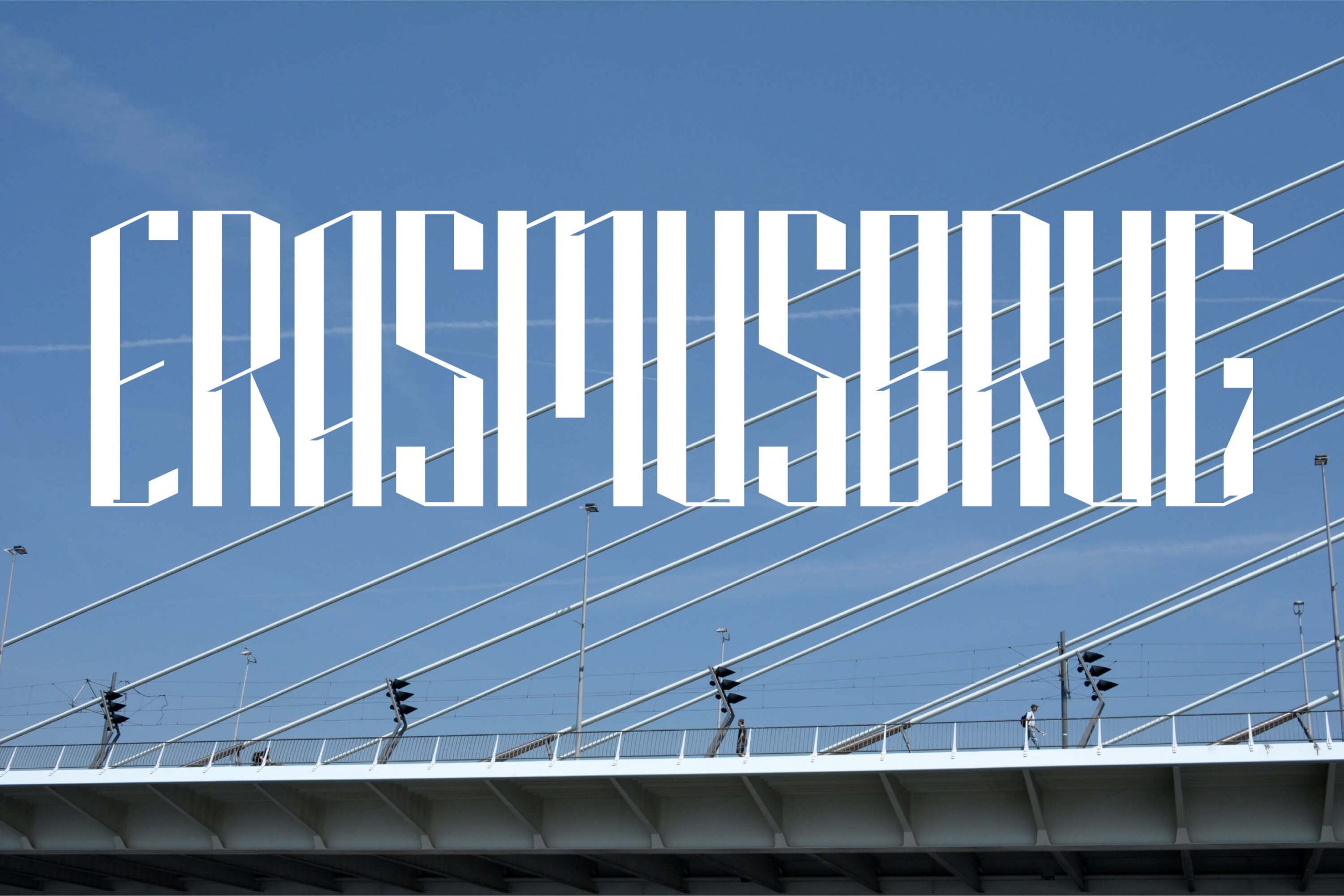
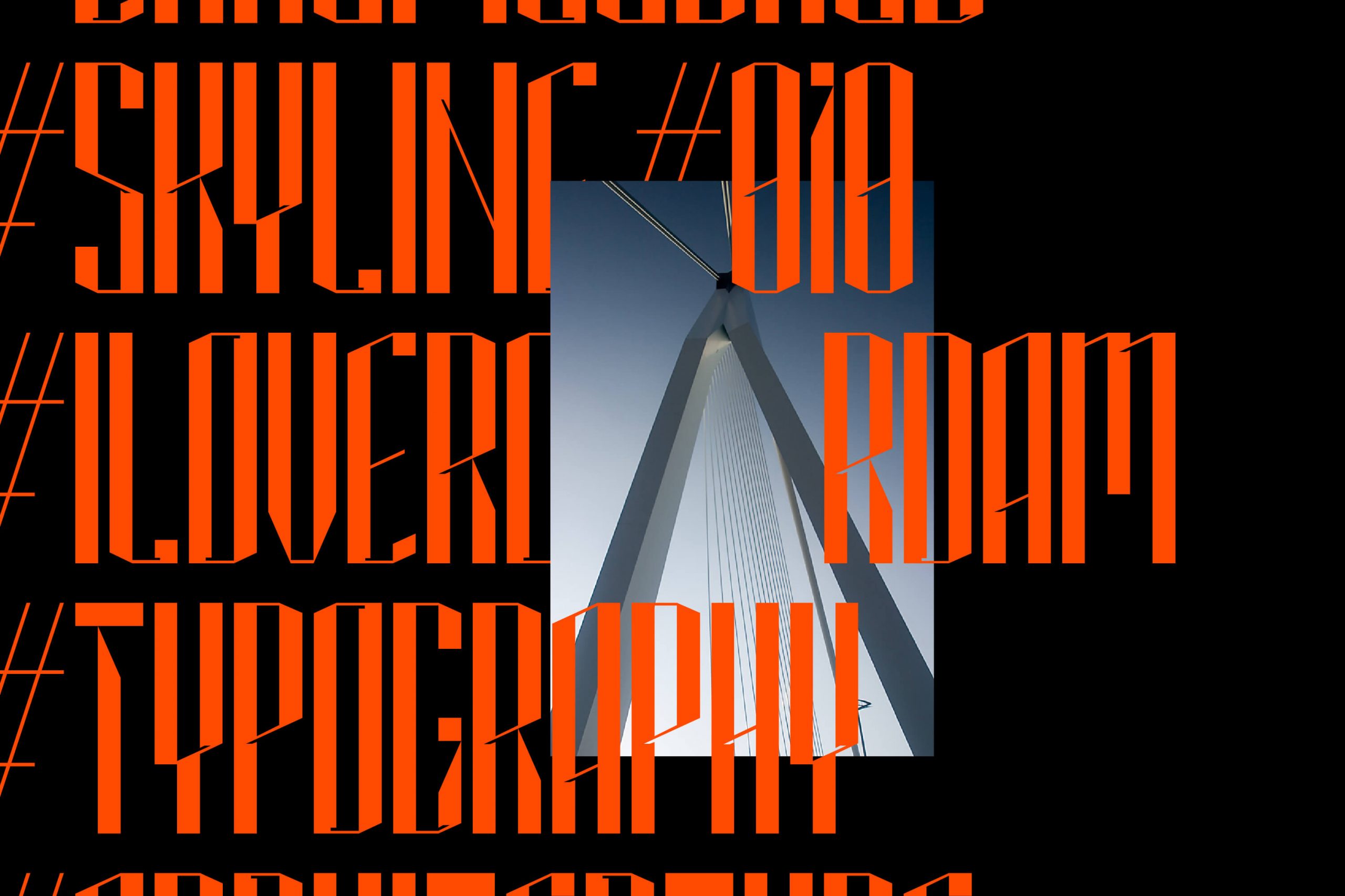
An architecturally inspired display font to celebrate the 25th anniversary of the Erasmus bridge.
Client
Self-Initiated
Services
Brand Identity
Photography
Hans Griep, Arend, Herwin Thole, George Pencz, Hieu Dang, Marcus Holland-Moritz, Marc Samsom.
Read more +
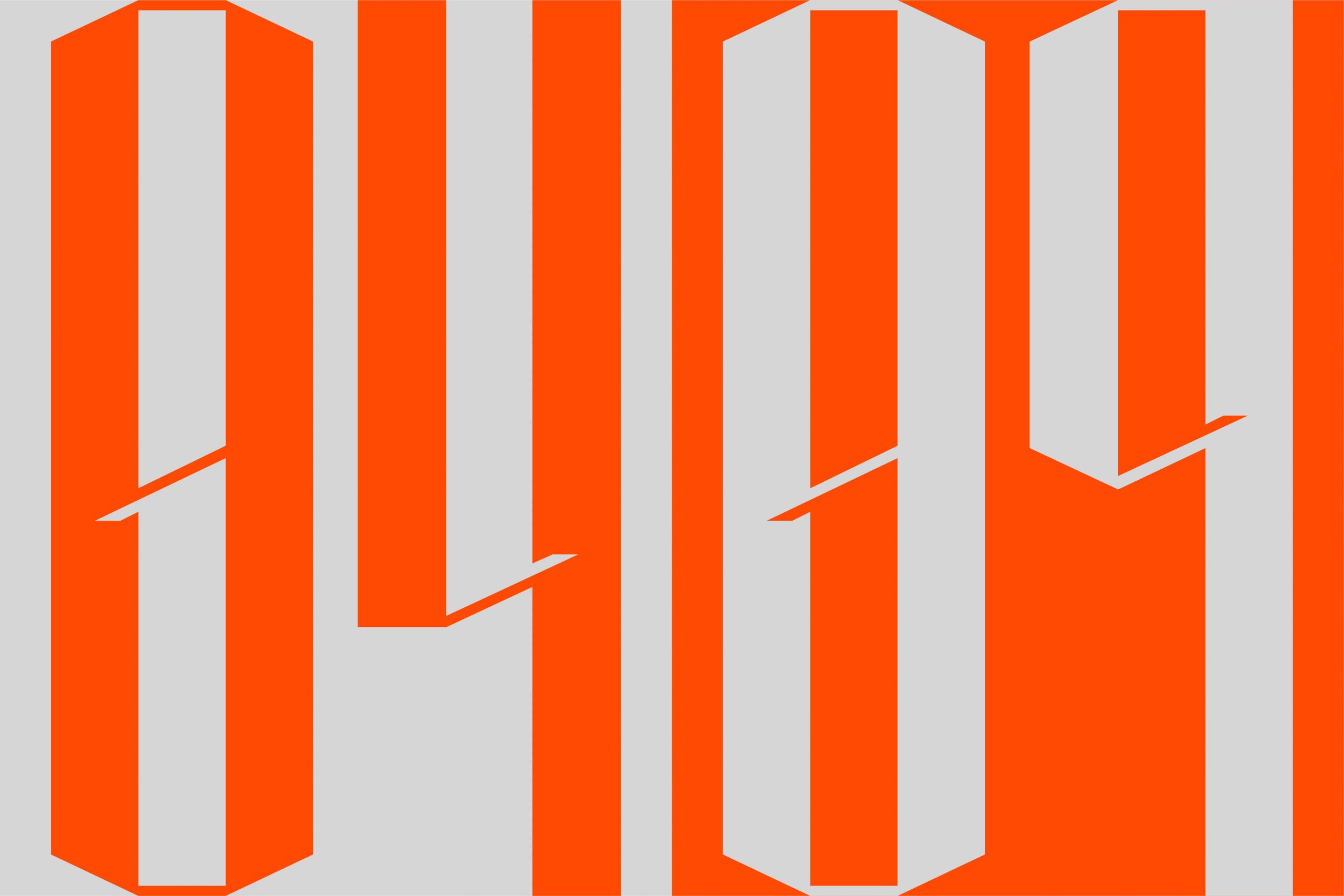
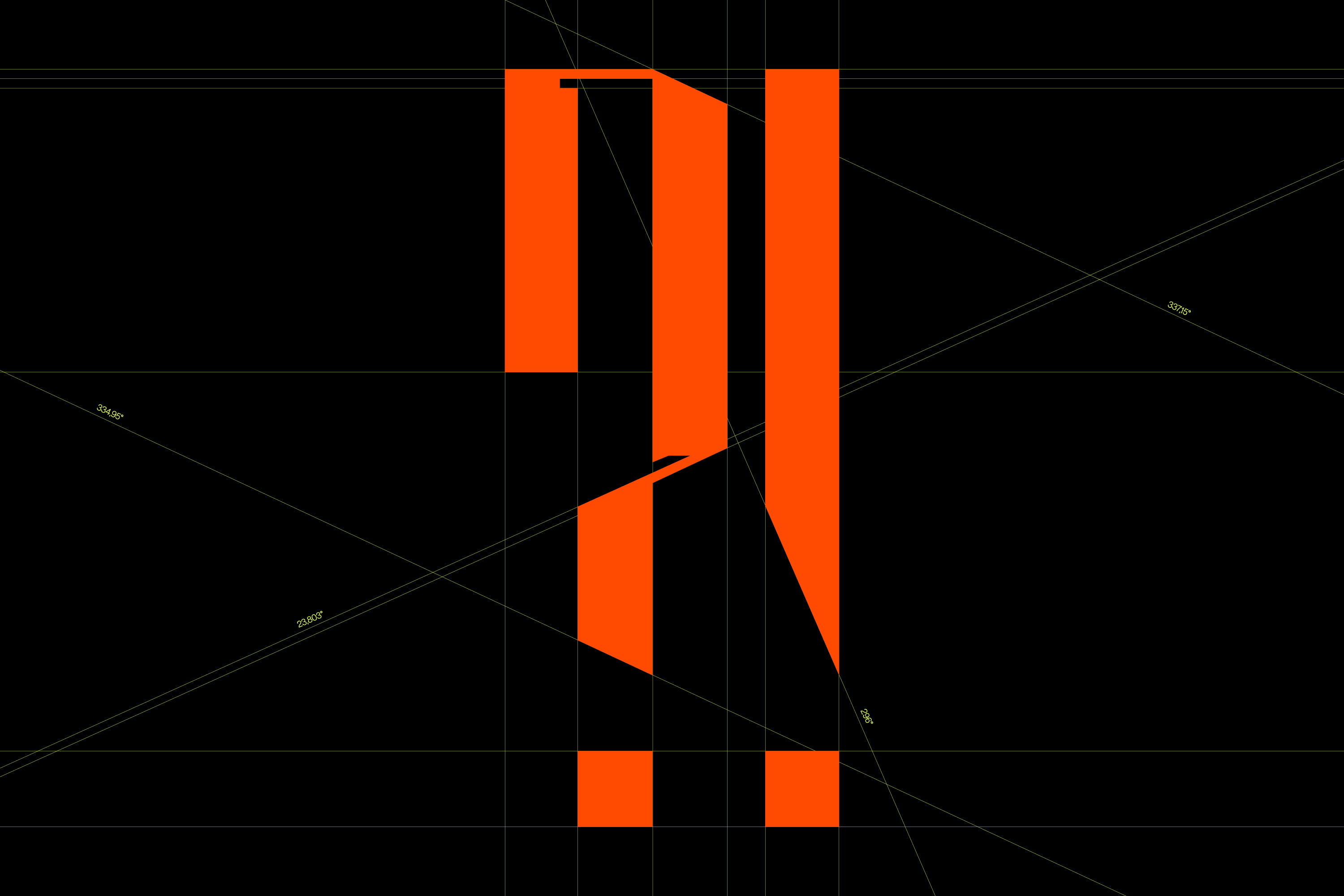
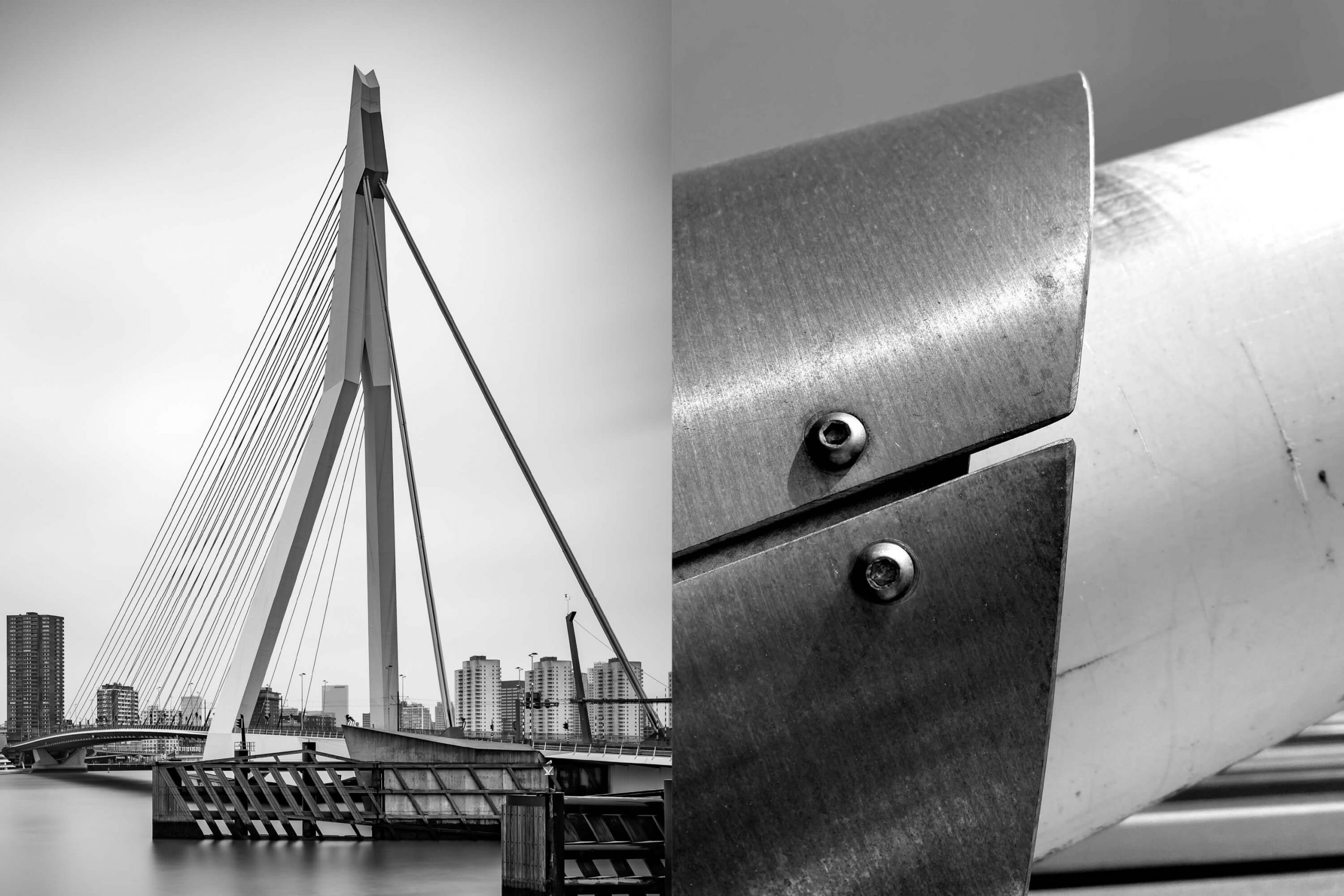
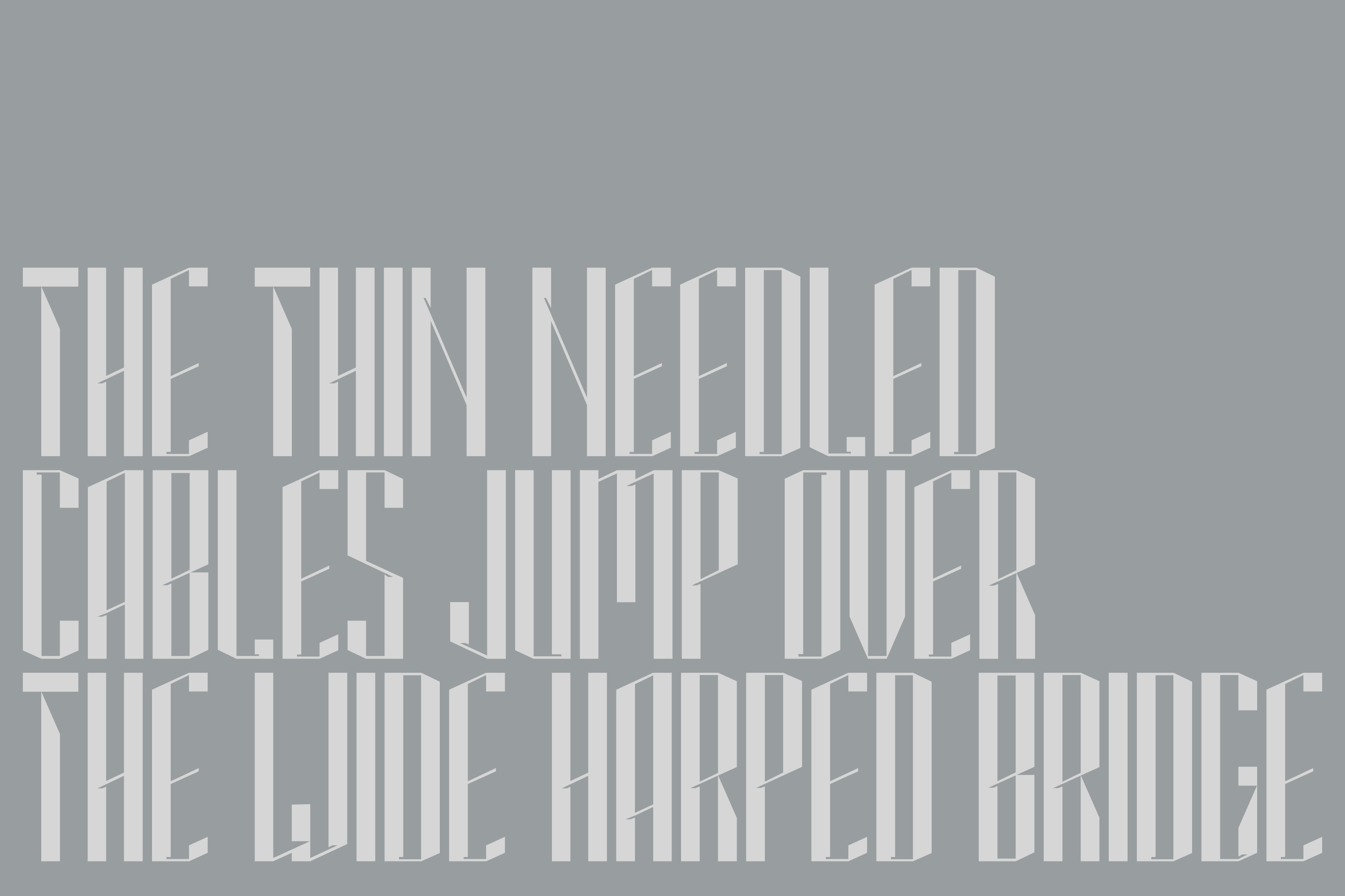
The various angles in the font take their origin from the bridge itself, while a bold basis combined with sharp yet subtle line-work make these letters reminiscent of the Erasmus bridge profile; thin as a needle, wide as a harp. The evocative characteristics of the font lean into the industrial nature of the city’s harbour. Erasmusbrug25 is a gift from Rotterdam to the world, and is available for free to download below.

Erasmusbrug25 is a gift from Rotterdam to the world, and is available for free to download here.
Project & Font design/ Dittmar
Release date/ 4 September 2021
File Formats/ TTF, OTF
Explore more on Instagram @Erasmusbrug25