A digital production company that specialises in innovative and sustainable solutions across the online, mobile and gaming space.
Client
The Project Factory
Services
Brand Identity / Strategy / Online & Digital / Print & Packaging
Read more +
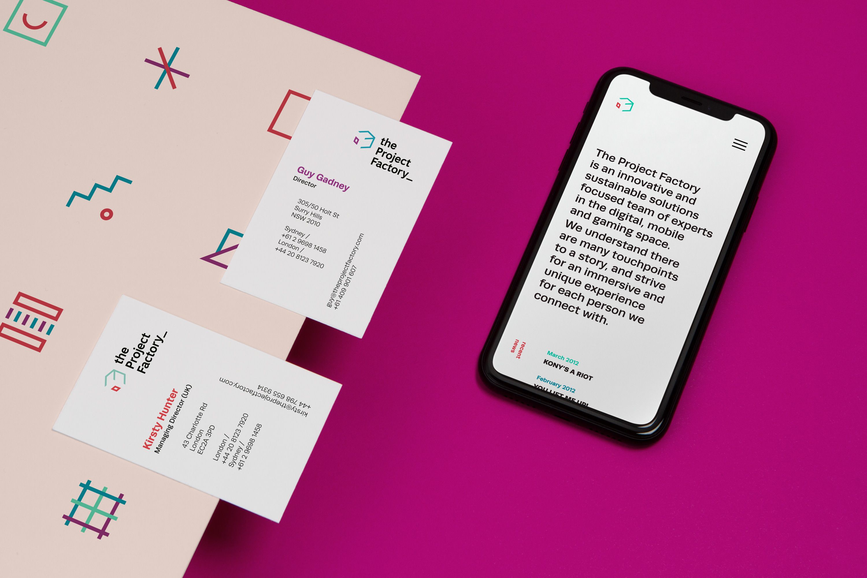
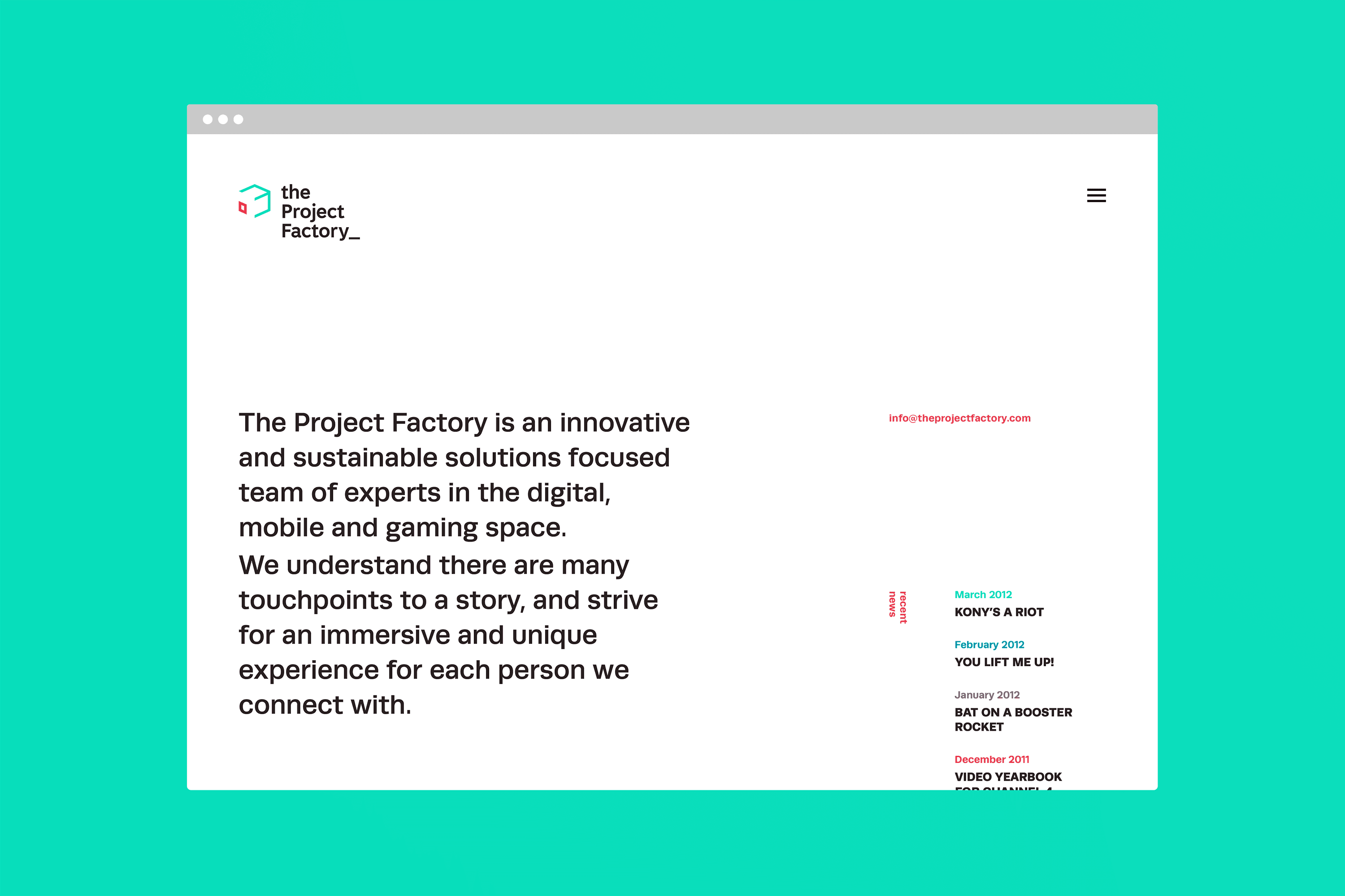
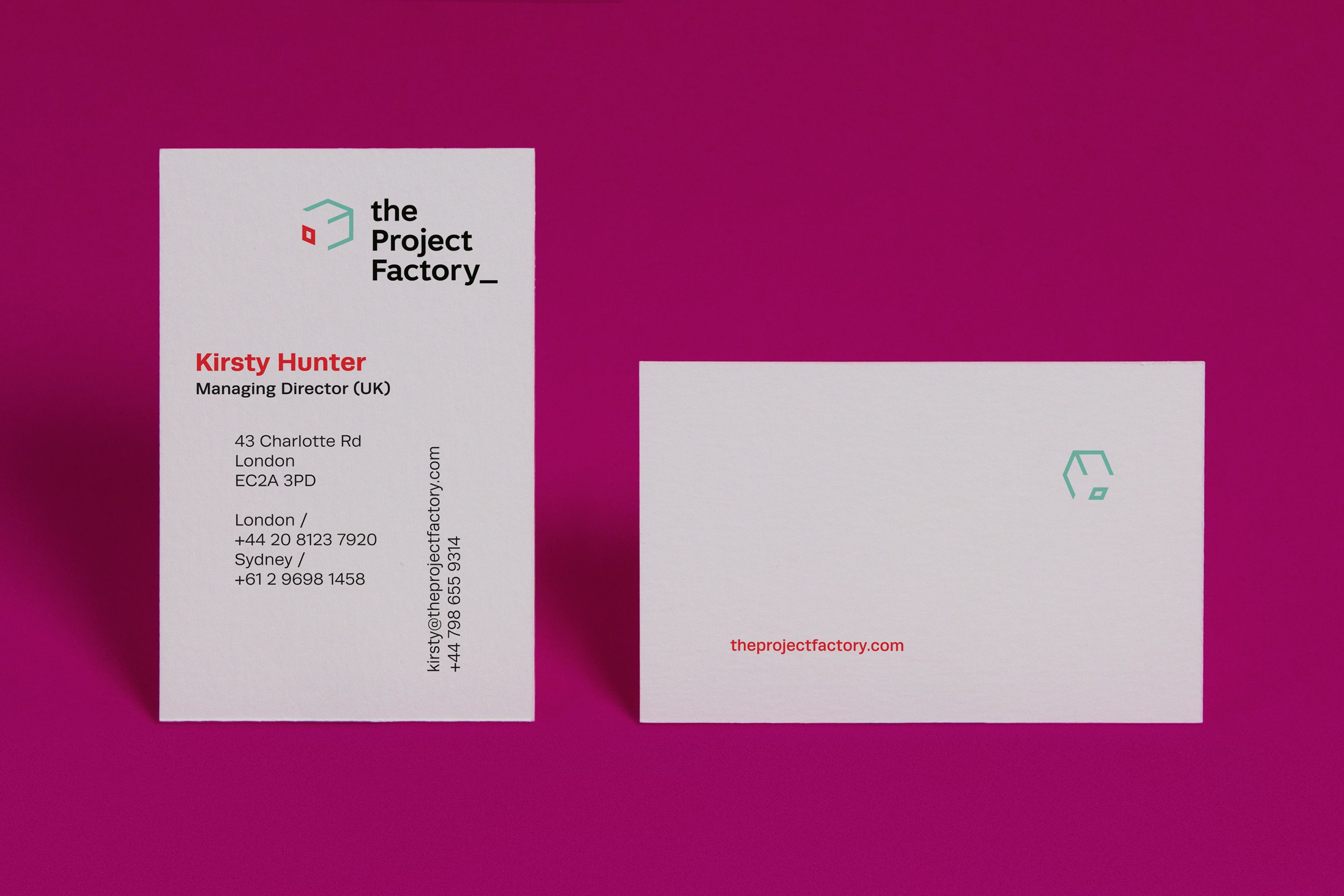
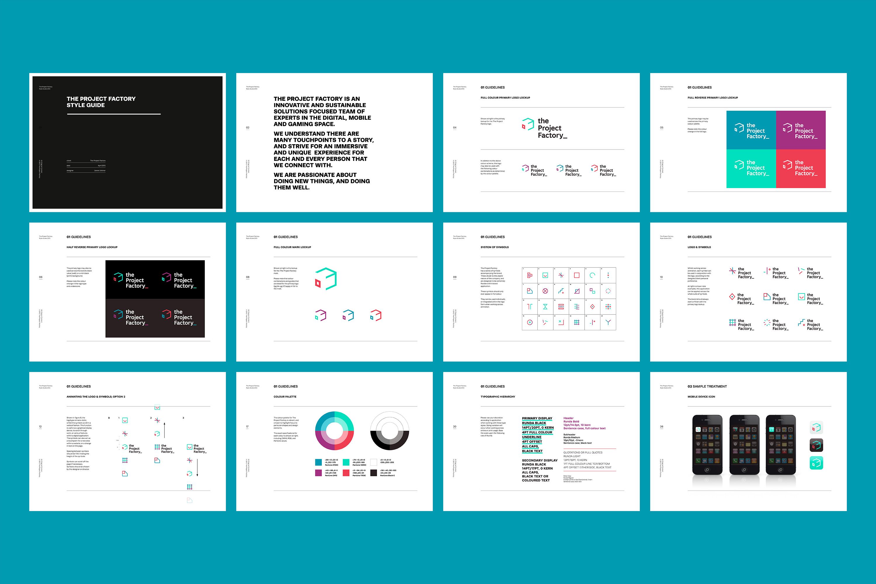
The brand refresh aimed to showcase the company’s creativity and diverse thinking in a professional manner. As the name suggests, the client also wanted to be seen as producers of a high volume of good quality work.
The new brand is inspired by a rubix cube, introduced to reflect the communication and connections that the company has to offer, as well as referencing a basic iteration of anything digital; the pixel. Included in the brand update was a moving asset suite comprising of 24 symbols. This graphic language acts as a metaphor for the cogs of the factory turning, and are used to reflect the playful nature of the brand.