A cooperative of growers that is currently the largest floriculture marketplace in the world.
Client
Royal FloraHolland
Services
Brand Identity / Strategy / Commercial Integrations / Online & Digital / Print & Packaging / Motion Graphics / Photography
Photography
Jeroen Dietz, Mark Groen, The Creative Hub powered by Canon
Brand video music
Beau Zwart
Read more +
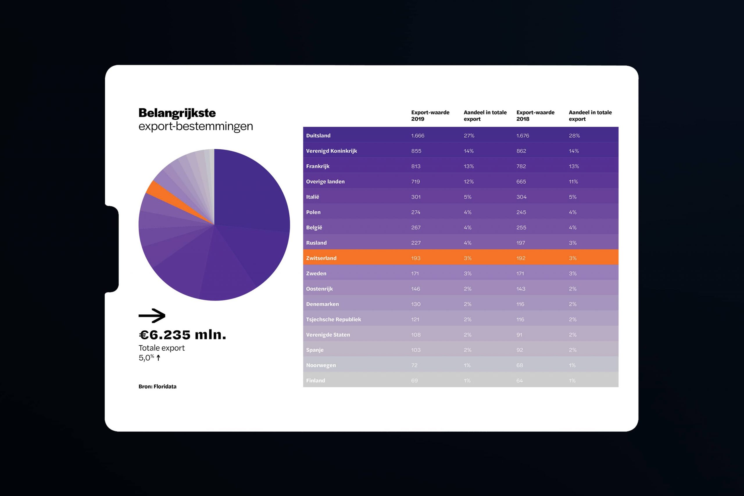
The cooperative has been bringing together growers and buyers for over 100 years, and is one of the most important export sectors in it’s country of origin, the Netherlands. To remain at the heart of the international floriculture sector, Royal FloraHolland needed to be perceived as an active and progressive digital enterprise. One of the challenges we faced, is that large companies aren’t seen as quick or agile moving.
Given the company’s establishment in the Dutch culture, we saw an opportunity to use that promise of heritage of community in parallel with innovation to lead forward. Royal FloraHolland provides an established ecosystem that can help accelerate the members of its cooperation. The creative needed to develop a consistent and ownable brand story, improve creative efficiency, and streamline the identity for all internal and external stakeholders alike.
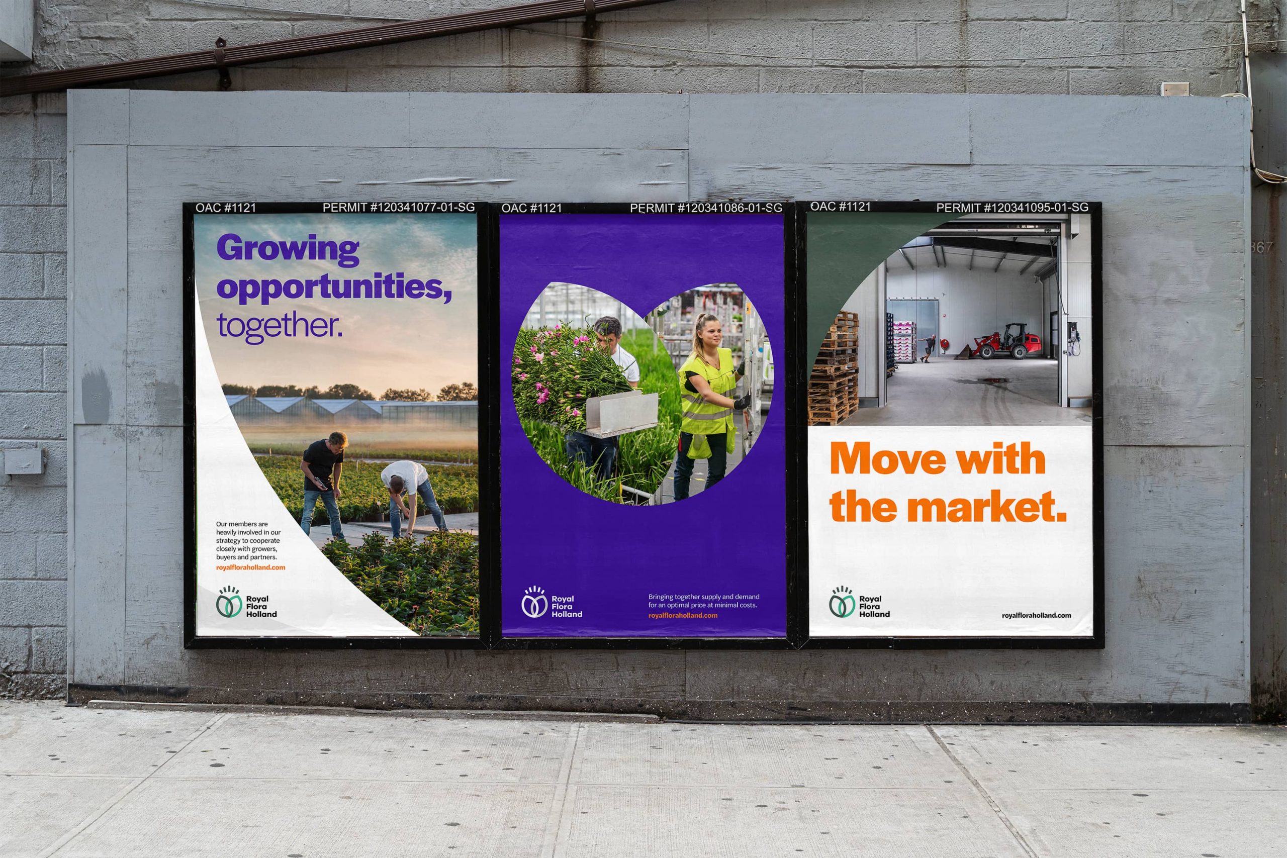
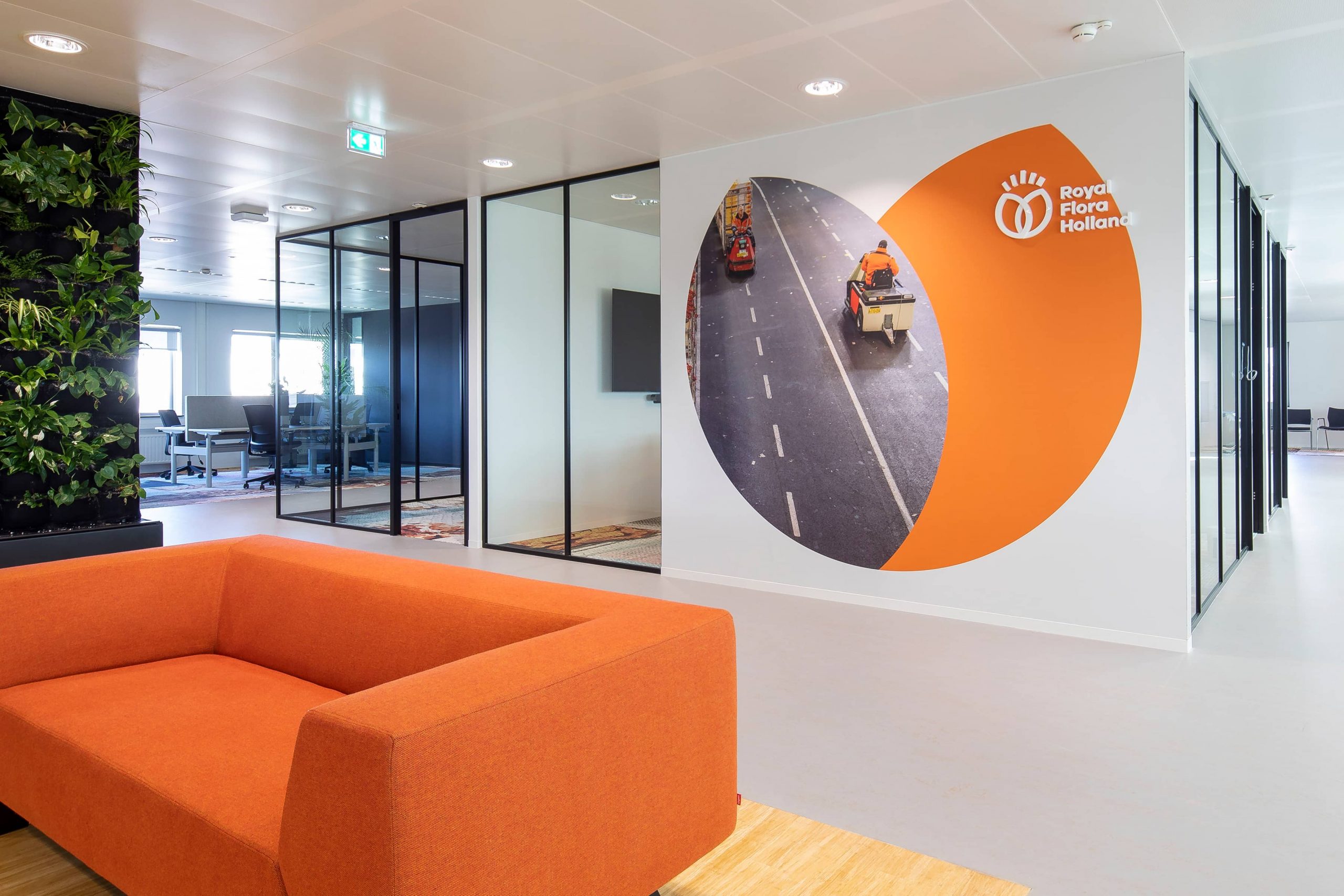
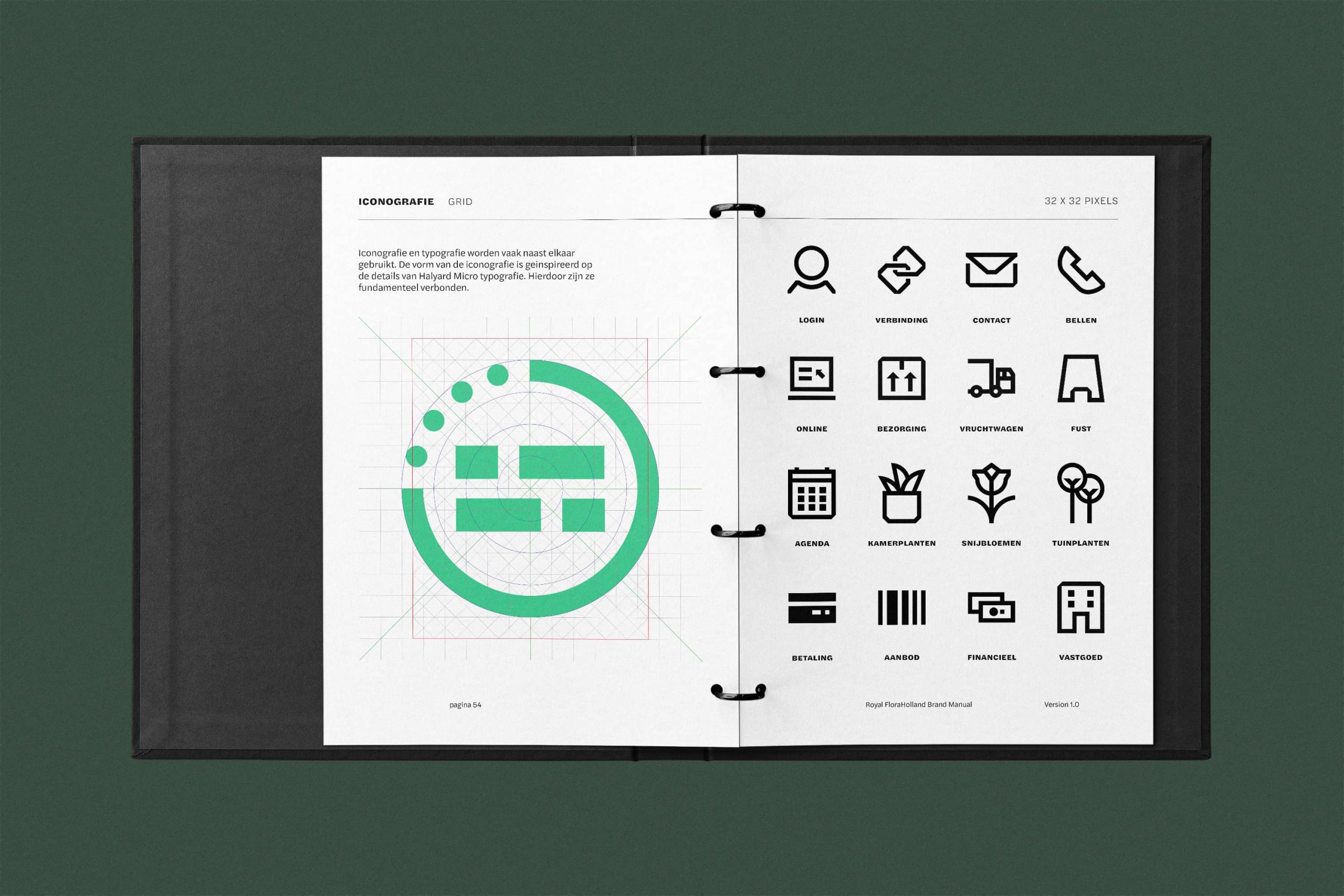
The company had already gone through a rebranding process in 2016, so were hesitant to relinquish their existing logo. Knowing that this was one form element we had to take forward into the proposition, we decided to start there by taking the logo itself to develop a new visual language. The dynamic curves help to create a diverse form language that afford flexibility in it’s use, whilst still regulated within a defined grid structure.
The power of Royal FloraHolland is it’s incredible international reach in the floriculture sector, and their new brand gives a sense of movement and growth to compliment their new positioning; Connect to Grow.